
At the top
 |
| Ed Henninger |
She recently wrote:
"I attended a seminar one time where you told us your rules for top-of-the-page advertising. When you can, would you share them with us on your blog?"
I asked Tia if it was OK to handle her question in a hint or column instead. She agreed ... and here we are.
For ads that appear at the top of a section front or anywhere on page 1, I have four simple rules:
1. WE DESIGN IT: Sorry, we're not going to accept an ad designed by the advertiser's daughter's boyfriend, who took a quick course in Illustrator at the community college. These ads are at the top of the page and will draw considerable reader attention – we need to be sure they speak to the reader of the kind of quality work we can do. An over-designed ad will cheapen the look of your newspaper, and you don't want that. Top-of-page ads should get the best work from your best designer. We design it.
2. TWENTY-FIVE WORDS OR FEWER: We're not going to clutter the ad with excess verbiage. How do I define "excess verbiage"? When it comes to top-of-page ads, I define it as anything more than 25 words. It's that simple. Within that limit, you can do a good job of creating a memorable message for your advertiser. The briefer. The better. Twenty-five words or fewer.
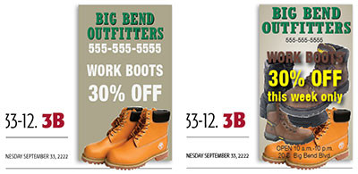
3. ONE IMAGE: Take a look at the ads in the illustration accompanying this column. The ad on the left is clean and does the job of illustrating the message: work boots 30% off. No need to show more boots, as in the ad on the right. Readers will assume that Big Bend Outfitters carries more than only one type or brand of work boots, don'tcha think? The single image allows for some negative breathing space in the ad and gives it focus. No need for more. One image. One.
4. CHARGE A HEFTY PREMIUM: Stop giving away some of your best space. Charge a good premium for the ad. Some publishers will double the price of an ad at the top of the page. Make it clear to the advertiser that this is space you're not just willing to sell to anyone, that his ad will get more looks and generate more traffic. Charge a hefty premium.
So there ya have it: Ed's arbitrary and capricious four rules for page 1 and top-of-page ads.
I'm convinced they work. Try them ... I think you'll be convinced, too!
WANT A FREE evaluation of your newspaper's design? Just contact Ed Henninger: edh@henningerconsulting.com | (803) 327-3322
IF THIS COLUMN has been helpful, you may be interested in his books: "Henninger on Design" and "101 Henninger Helpful Hints." With the help of his books, you'll immediately have a better idea how to design for your readers. Find out more about "Henninger on Design" and "101 Henninger Helpful Hints" by visiting his website: www.henningerconsulting.com
ED HENNINGER is an independent newspaper consultant and the director of Henninger Consulting. He offers comprehensive newspaper design services including redesigns, workshops, staff training and evaluations. E-mail: edh@henningerconsulting.com. On the web: henningerconsulting.com. Phone: (803) 327-3322.
Keywords
Henninger, design


