Absolute design
 |
| Ed Henninger |
One definition of the word "absolute" is: "not qualified or diminished in any way."
Works for me.
It works because I believe in some design absolutes – call them laws, if you will. I'm convinced that a design that does not adhere to these absolutes is a design that is faulted.
Put it this way: If I owned a newspaper, I'd be sure these 10 absolutes are followed. Always. No question. No sidestepping. Always.
So, if you wanna work for me, here are the 10 design musts I'd expect you to learn and live with:
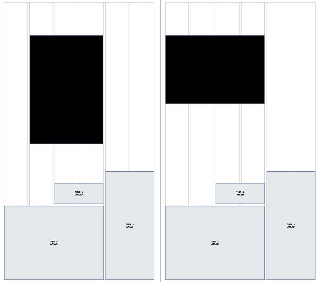
1. Place the visual first. The lead photo or graphic you place on the page is the element your reader will see first. Place it where it will be most effective – and give it the size it needs to have some impact. Remember, you can arrange type in various configurations around visuals, but visuals (for the most part) are rectangular and can't be "configured to fit." So place the visual first then arrange the type around it as needed to create a well-designed package.
2. Align text to the baseline. You want your publication to have a professional, planned, polished look. This is the first step in getting there. It's easy to set up, it's easy to work with. Most important, it makes your paper easier to read.
3. Negative space is a positive force. Stop working so hard to fill every square inch of space on the page. Allow the page – especially in features packages – to breathe where you can. No, I'm not suggesting you leave open spaces on the page willy-nilly. But I am pointing out that a bit of negative space, for example, around the edges of a photo page helps to create a more pleasing, more comfortable package for your readers.
4. Think and work in picas. Yes, I respect the fact that advertisers and ad reps always deal in inches. And I don't argue against that. But if you're working on the design of the entire page, you must learn to think and work in picas. Why? Because a quarter-inch is just too much space between elements and packages. And an eighth of a inch is too tight. So, what number falls exactly between four and eight? Six. And how many picas are in an inch? Six. Well ... whaddaya know! It's not difficult to train yourself to think in picas. All ya gotta do is start. Give it a week and you'll be there.
5. Don't leg obits or recipes. Obits are what I call "Bible material." The relatives of the deceased want to be able to clip an obit from your paper and place it – in one piece – in the family Bible. They will not want to have to tape it or staple it together. And those who cut out your recipes will want to clip them in one piece so they can file and use them more easily.
6. Always fix a widow. A widow is a line of type at the top of a column that does not fully go across the width of the column. These are distracting and they just look wrong. No, readers may not object to these, but widows send a subliminal message that you're not careful. And if you're not careful about your typography, how can readers be sure you're careful about getting the facts straight in a story? The details matter. Get them right.
7. Design the page first. Don't wait until you have all the photos, all the stories. You can't afford the time to do that. Once you have a good idea of what's going on the page, do a loose design of how the page should look. This takes planning and communication. Yeah, I know: radical concepts in some newsrooms. If a story comes in a bit too long, be ready to trim it. If it's too short, look for ways to help fill the space. You can use another line of headline, a subhead, a pullout, another visual.
8. Think like readers. Stop thinking like the editor, designer, writer or photographer you are (in some cases, I know, you're all of these!). Start asking yourself what the reader wants to know ... what the reader needs to know: Do I really need to know all these details? Does this story really need to be this long? Wouldn't it be better for me to see these facts in a list? In a chart? On a map?
9. Be consistent. Decide on the look for your newspaper ... then stick to it! If your headline typeface is Baskerville, use different fonts and sizes of Baskerville. Don't toss in a smidgen of Minion here or a smattering of Caslon there. And puhleeeze bring a consistent look to your standing heads. Create a look that works for all of them, then stay with that look. For the crime report ... weddings ... sports ... editorials. All. The same.
10. Less is more. Stop trying too hard. Relax and quit over-designing. If there's any one fault I see in the design of community newspapers, it's over-designing. Often, it's obvious in the many different designs of standing elements (see previous paragraph). Readers want us to give them packages that are uncluttered. Clear. Concise. Consistent. Compelling. Designed with ease of reading in mind. We can give them that if we keep things simple. You show me how good a designer you are not by what you choose to place on the page, but by what you choose to take away. Take it easy. Less ... really is more.
Actually, I have more than 10 absolutes. At least another 10 ... maybe more. But, for now, these are the 10 I think matter most.
WANT A FREE evaluation of your newspaper's design? Just contact Ed Henninger: edh@henningerconsulting.com | (803) 327-3322
IF THIS COLUMN has been helpful, you may be interested in his books: "Henninger on Design" and "101 Henninger Helpful Hints." With the help of his books, you'll immediately have a better idea how to design for your readers. Find out more about "Henninger on Design" and "101 Henninger Helpful Hints" by visiting his website: www.henningerconsulting.com
ED HENNINGER is an independent newspaper consultant and the director of Henninger Consulting. He offers comprehensive newspaper design services including redesigns, workshops, staff training and evaluations. E-mail: edh@henningerconsulting.com. On the web: henningerconsulting.com. Phone: (803) 327-3322.
Keywords
Henninger, design


